


What to do when your colour scheme feels off?
5 easy ways to get back on track.

We all start with the best intentions but as decisions pile up so do the doubts - What if it doesn’t match? What if I make the wrong choice? And before you know it paralysis by analysis has set in.
Adding to that pressure is the ticking clock of guests arriving for the holidays and this room needs to be redecorated. In truth - they’ve got no idea what colour’s currently on your walls!
Creating a colour scheme can feel daunting but it doesn’t have to be, with a little guidance you can confidently make choices that feel like you. Here are my tips to bring ease to your colour scheme.
How to get back on track when your scheme feels off
There’s no wrong colour

Colour is entirely subjective, there’s no such thing as the ‘wrong’ colour. So, if a hue makes your heart sing embrace it!
But if the scheme feels disjointed, it’s rarely the colour itself to blame. More often, the issue lies in how it’s being used or what it’s paired with. Swap out colours or adjust their placement until it feels right. Sometimes, shifting a beloved hue from a hero to an accent role can make all the difference.
Let nature lead
True brilliant white doesn’t exist in the natural world, yet we keep trying to squeeze it into our homes. Instead, when building a white based scheme take inspiration from nature. Choose whites with subtle undertones that harmonise your palette, creating a softer, more cohesive look.
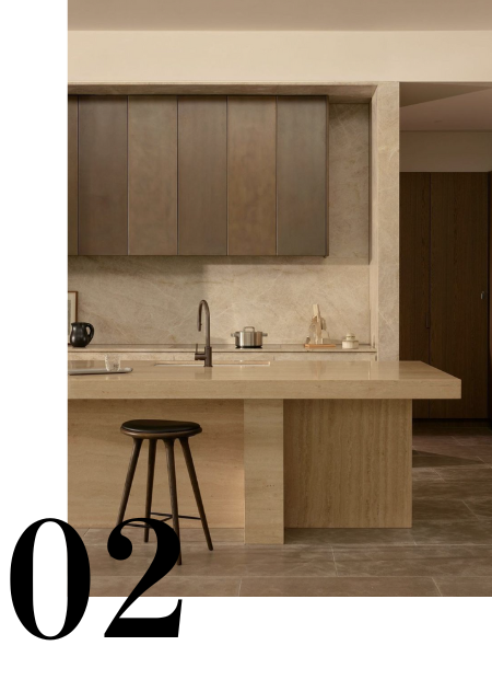
Remember, a neutral doesn’t have to be white, shades inspired by sand, clay and stone create beautiful warm neutrals that add depth to a space.
Never a solo act
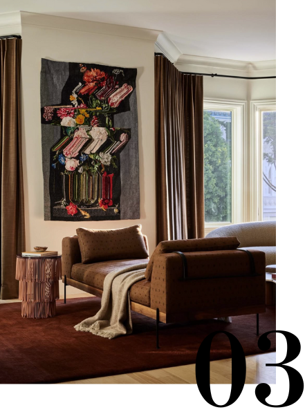
Paint colour never exists in isolation – it’s always part of a bigger picture. Viewing a paint sample on its own won’t fully capture the impact the colour will have in a space surrounded by furniture, art and objects. Instead think of it as one piece of the design puzzle. Collectively the pieces will shape the mood and feeling of a space.
Take this Studio Plow image as an example. On its own the wall colour might seem understated, maybe even plain. But when paired with the furniture, artwork and accessories, it transforms in a warm luxurious backdrop. The paint becomes part of a cohesive palette, bringing the space to life.
Let the light guide you

Colour looks different as the light shifts throughout the day. Observe the changes from morning to night, focusing on the time of day you use the room the most. How does the colour look, is it bringing the ambiance you envisaged, or does it need tweaking?
A lighting tip - get off your computer! Colour almost never looks the same on screen as it does in person. Most major brands offer colour samples, collect them, bring them into your space and see how they interact in your light and surroundings.
Parting tips

Experiment - A great scheme often requires a bit of trial and experimentation. Don’t hesitate to move or swap colours until everything clicks.
Trust that gut feeling - If something feels off it probably is. Equally, listen to your gut when it starts to feel right - intuition is your best guide.
Pause - Sometimes, stepping away from the process can bring the clarity you need. Given time (and a good coffee) the right option will often surface.