


The colour you're overlooking but shouldn't be.
Introducing Olive Green.

There are colours we reach for instinctively – whites, greys, duck egg blue. They feel safe, you’ve seen them at your neighbours, in magazines. They don’t extend you but equally they remove the anxiety of getting colour selection wrong.
Then there other colours that quietly work harder than you’d expect, yet remain underused.
If I had to name a colour that quietly does the hard work of bringing a space to life without demanding attention, it would be Olive Green.

It’s not as obvious as a deep blue, as safe as a greige, but it does something neither can – it creates a soft, cocooning feel, a sense of comfort, all while adding depth and warmth. I see it as a considered neutral – for those willing to look beyond the popular neutrals in a fandeck. It’s calm, livable and just unexpected enough to feel intentional.
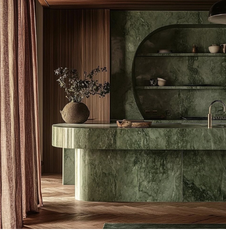
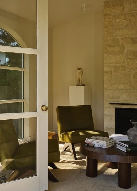
There’s a perception that deeper (dark) greens are bold, even wild. But Olive is anything but, it’s sophisticated with a contemporary edge. As a rich neutral, it provides a strong backdrop to layer with furniture, artwork and a mixture of materials including timber and metal.
And then there’s the light. In warm dusky tones, Olive is magic. Get it right and the interplay with light is stunning, shifting between golden yellow undertones and deep khaki greens. As the day fades, the colour deepens becoming more complex, inviting you into a space that feels like a big hug at the end of a long day.
How to pair it:
With white – a classic combination but ensure there’s a touch of colour, a whisper of yellow nothing too clean or crisp.
My favourite pairing – Pigmented pinks like Aalto’s Treaty. The umber and brown oxide undertones play with Olive’s creating a nuanced layered effect.

You’ll often see Olive in bedrooms and living rooms, where its natural depth feels restful. But it’s just as striking on kitchen cabinetry, creating a moody richness that feels contemporary without being overly modern. Olive Green isn’t just for walls – it’s a stunning accent colour too. Whether used on a display plinth, small furniture pieces it adds a touch of sophistication without overwhelming the space. You can even play with gloss levels, a matte finish on cabinetry is soft and inviting, while a high gloss enhances the depth and richness creating an edgier feel.
The thing with Olive is this: once you see it done well, you wonder why it’s not everywhere.
//
I’d love to hear any ideas you have for colour conversations or Colour Edited, leave a comment below, or get in touch on amiewhite.nz or Instagram.