To be honest I’m not sure I have ever been a fan of yellow (shock!). The last time I remember wanting a yellow space was in the 90’s where a star and moon combination reigned.
Whilst the celestial theme may not be back and in hindsight I’m thankful to my parents for not letting me indulge in trends, there’s no denying that yellow is back in a big way. Dulux have already named True Joy 2025 Colour of the Year and in forecasting we’re seeing everything from soft buttery tones to golden jewel hues.
So how can one introduce yellow without feeling like a throwback to the 90’s?
5 ways to work with Yellow

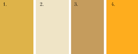
As with all hues they don’t exist purely in their primary form, there are countless tones and shades in between, each suited to different individuals and spaces.
With yellow it’s about celebrating that inherent joy, bringing out the natural energy that comes from the colour. On one end of the scale you have cheerful dopamine hitters and at the other warm creamy tones. The later, less familiar but surprisingly much easier to work with, their ability to span seasons, bring warmth and sit beautifully against a natural palette.
Considered Pairings
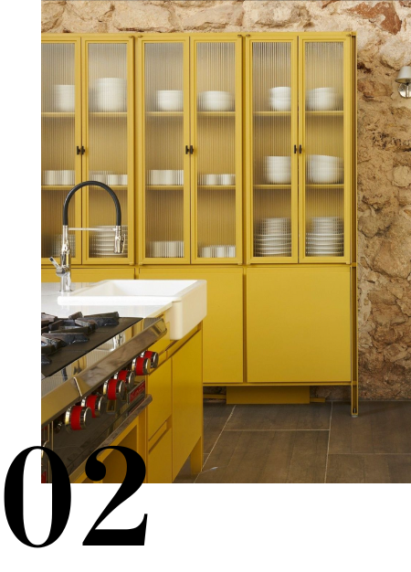
Pairings within a scheme are what ultimately give us the sense of harmony and cohesion, making a space feel complete.
Look for a common thread whether that be a cool or warm undertone which runs across all materials and finishes to tie them together. Above, the walls have the same warmth and depth as the cabinetry, taking the heat out of the yellow to create balance within the space.
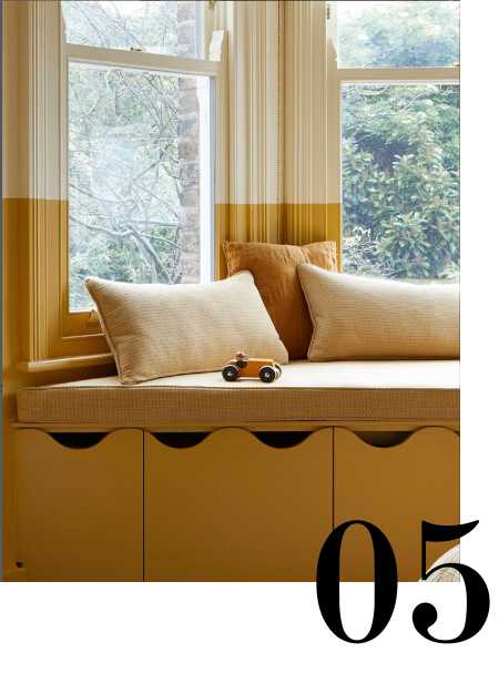
Balance & Proportion

This Parisian apartment is minimalist yet warm, as if the whole room was dipped in paint. There’s no one feature drawing your eye’s attention instead the colour acts as a serene canvas. In contrast a strong yellow would feel irritating and unsettling, even a feature wall would advance the space, disrupting it’s sense of openness.
It’s about selecting the right shade, yes - but it’s also about proportion. Think of yellow like Chilli powder, use the amount that feels right for you.
Off the Walls

Yellow isn’t exclusively for paint. Flip the script by taking a neutral as your base and then inject colour through furnishing, lighting or artwork. This can feel less risky than splashing the walls with colour but there’s something beautiful in the burst of energy created, making the space feel alive with a feeling of home reflective of its occupants.
Some hues that pair beautifully with yellow include hessian shades, clay, browns or deep greens. And don’t forget playing with negative space, the break gives your eyes a breather from yellow.
Know your Audience
While I might pass on a starry yellow, it’s perfect for a child’s room—vibrant and playful. Personally, I lean toward creating a soothing, relaxed vibe with a shade just a step above cream.
Choosing the right yellow means understanding the mood, purpose and people within a space. Here’s a couple to get you inspired:
Dulux True Joy - A distinct and versatile yellow. Look at it amongst the Human Colour Story, this is where I see it at its best.
Aalto Chance - A buttercream yellow which evokes feelings of happiness and warmth, ideal for south facing spaces.
Farrow & Ball India Yellow - A deep mustard yellow, cozy and surprisingly subtle when paired with dark tones. Use sparingly in smaller spaces.
Aalto Raincoat - A punchy yellow that works beautifully as an accent or on statement furniture.