


Red, Red, Red
No longer reserved for the brave and the bold.

You've probably noticed each week on my Instagram I like to focus on specific hues, exploring how the different application of a singular colour can transform the feel of a space. My hope is that others will grow to love colour as much as I do, and through swoony-worthy imagery gain confidence to bring it into their world.
But…there's only so much you can delve into on an Instagram square, so here we'll go a little deeper, getting into the details that would make the eyes of others glaze over. Let’s start big - Red. There’s no need to be shy, after all, red was one of the first colours developed for modern art and it’s the first colour the human eye perceives after black and white.
5 ways to introduce red

Previously reserved for the bold and brave. But now as we seek alternatives to white on white, the unexpected inclusion of red within a palette instantly elevates any room. It could be argued that red is as versatile as a neutral because of its ability to work across any palette of colours and materials. And even when it feels like it doesn’t belong just like a good red lipstick it manages to pull everything together, adding that final defining statement.
Start Small
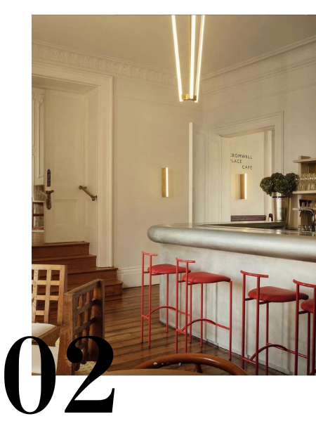
Before jumping into walls, start small - a chair, piece of art or even cushion will do the trick. Bringing a sense of energy, passion and joy not to mention it’s guaranteed to get conversation going.
Some of the best applications I’ve seen are the smallest, the base and cord of a pendant light, candle holders or table legs.
Earthy to Ruby

Remember it doesn’t need to be fire engine red, hues can shift from earthy (brick to burgundy), ruby to pastel, mushroom tones to raspberry.
We tend to think of red, even as an accent, as having to be clean saturated colour but combinations like Aalto Olive with Aalto Treaty 1/2 are equally as divine. Infact the slightly greyed or toned down colour comes with a feeling of sophistication, a skill in curation. To the less adventurous it also comes with a feeling of liveability, less trend more timeliness.
Tone on Tone

A fool proof approach to introducing red is to go tonal. The result is impactful and beautiful but minus the stress of whether you’ve created balance and cohesion.
Soho Home above has it right, soft pinky tones alongside rich Bordeaux reds, leaving a feeling of sophisticated calm. On a closer look you’ll notice each surface or piece of furniture draws on a different shade of red yet remains collectively harmonious.
Don’t forget about considering the gloss level - this is an easy way to create variation in colour without having an extensive palette. A combination of finishes adds another layer of depth to your design.
For Starters

Red often occupies a smaller section of many brands’ collections compared to blues or greens. The good news? A focused selection makes it easier to narrow down the perfect red.
A couple of current favourites to get you started.
Aalto Red Red Red - A true bright with an unapologetic confidence. Works well as an accent or defining statement within a room.
Dulux Big Glory Bay - The pinky red of its namesake Big Glory Bay Salmon, there’s a sense of warmth making it perfect for creating a cozy atmosphere.
Aalto Inscription - An ox blood red with beautiful depth. Versatile in application, forming either the basis of a luxurious palette or sitting amongst a tonal scheme.
Bauwerk Colour Japonica - Bold and crisp with an earthy softness. A red that works well in both exterior and interior spaces. Soothing inside and the initiation of a talking point for exteriors.
