


Less theory more feel
Shifting the focus from correct to mood

What if it was less about theory and more about feel?
We talk a lot about the undertones, creating a scheme that’s complimentary, monochromatic, tonal, analogous. But what does this really mean? I’m yet to walk into a space and hear ‘I love the undertones, I love the way it’s throwing…’ but I do hear ‘This feels so like you or I love how relaxed this feels’.
What if we were to focus less on the theory, the type of scheme we should be creating and instead on our gut instinct? That first, innate reaction to a combination of colours. What if we described schemes not by theory but by feeling?
Colour is so emotive, it’s personal and without realising it our experiences influence our response to individual hues. We should be consciously tuning into how different colours make us feel, thinking about what mood we want to create, how do we want to react when we walk into a space.
The beauty in this approach is that combinations, pairings and schemes emerge that wouldn’t if you were only to play by the rules.
5 palettes that speak to me (and maybe only me, which is ok)
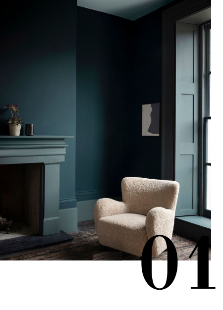
This is all about the mood, the feeling of quiet luxury. Not that quiet luxury but the one where it’s just you, an hour to yourself, where you’ve escaped a long day and are now curled up on this chair with a good book and a glass of red wine. The colour does the talking, deep enough to make you pause but enough visual interest through the trim work and material selections to keep you engaged.
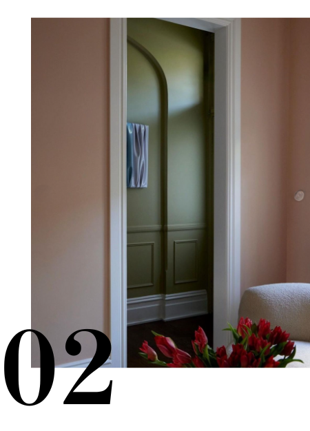
Often the default to evoke calmness is through whites so at first Studio Gemma’s choice feels a little risky but in situ an overwhelming sense of calmness and cohesion takes over. This comes from dialling back the red and green tones (always a perfect combination) to less saturated versions of pink and olive. Pink itself a neutral and in many situations can replace a white or cream hue. Olive gives an instant connection to the outdoors so immediately creates the association of nature, taking things a little slower.

This space is a masterclass in layering of colour, materials and textures. It feels like success, the kind of space that signifies you’re a grown up. At the same time alongside the sophistication is a sense of relaxation, not too formal to have your water glass on the table or legs swung over the side of the chair.
I could look at this all day!
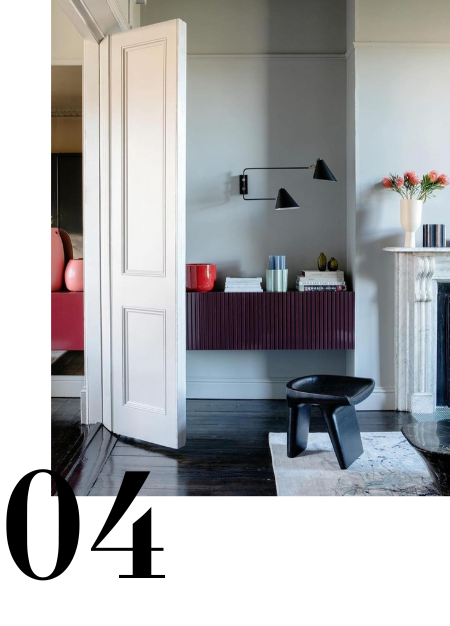
Classically cool but done with interest. I currently have 100 ideas running my mind on redecorating our living room, a classic 1810 villa. I imagine you walk into this space and it initially feels very put together, it’s nice. The more time you spend the more you notice the attention to detail, the placement of red hues tying the rooms together, the repetition of vertical lines, touches of black to anchor.

It’s not hard to imagine the summer breeze gently coming through the doors. A concise palette of soft pastels bringing to life the minimal furnishings with a mood of relaxation, lightness and peace. This space by Arent & Pyke is also a fine example of how to use a crisp white as your primary hue without stripping the soul from a space.